12 Best Ecommerce Landing Pages Examples with Best Practices
Several ecommerce merchants undervalue the significance of including landing pages on their websites. These pages provide important first impressions for new visitors while also encouraging returning customers to stay engaged. Despite its importance, many people overlook this function to the cost of their site's traffic potential.
An efficient ecommerce landing page is critical for maximizing the shopping experience, giving important information, and directing consumers to frequent checkouts. For quick page loading, this must be combined with fast ecommerce website hosting.
The intent of the landing page must be aligned with the stages of the sales funnel.
Determining the Purpose of Your Ecommerce Landing Page
High-converting ecommerce landing pages serve different purposes depending on where a potential customer is in their buying journey. Understanding these stages for landing pages for ecommerce, known as TOFU, MOFU, and BOFU, is crucial for crafting effective landing pages that convert.
TOFU (Top of Funnel)
- Focus: Awareness and brand building.
- Target audience: People who are unfamiliar with your brand or product category.
- Goal: Generate interest and educate potential customers about your brand and its offerings.
- Content: Informative, engaging, and broad in scope. Think blog posts, quizzes, introductory videos.
- Call to action (CTA): Subscribe to a newsletter, download an ebook, follow on social media.
MOFU (Middle of Funnel)
- Focus: Consideration and comparison.
- Target audience: People who are aware of your brand and interested in the product category, but still researching options.
- Goal: Nurture leads and move them further down the funnel by addressing their pain points and showcasing your product's value proposition.
- Content: More in-depth and solution-oriented. Think case studies, webinars, comparison charts, product demos.
- CTA: Request a consultation, download a white paper, sign up for a free trial.
BOFU (Bottom of Funnel)
- Focus: Decision and purchase.
- Target audience: People who are ready to buy and just need a final push.
- Goal: Drive conversions and close the deal.
- Content: Concise and persuasive, emphasizing the product's benefits and addressing any remaining doubts. Think product testimonials, limited-time offers, guarantees.
- CTA: Add to cart, buy now, claim your discount.
12 Best Ecommerce Landing Pages Examples
Here are the 12 best & few free ecommerce landing pages examples:
HelloFresh
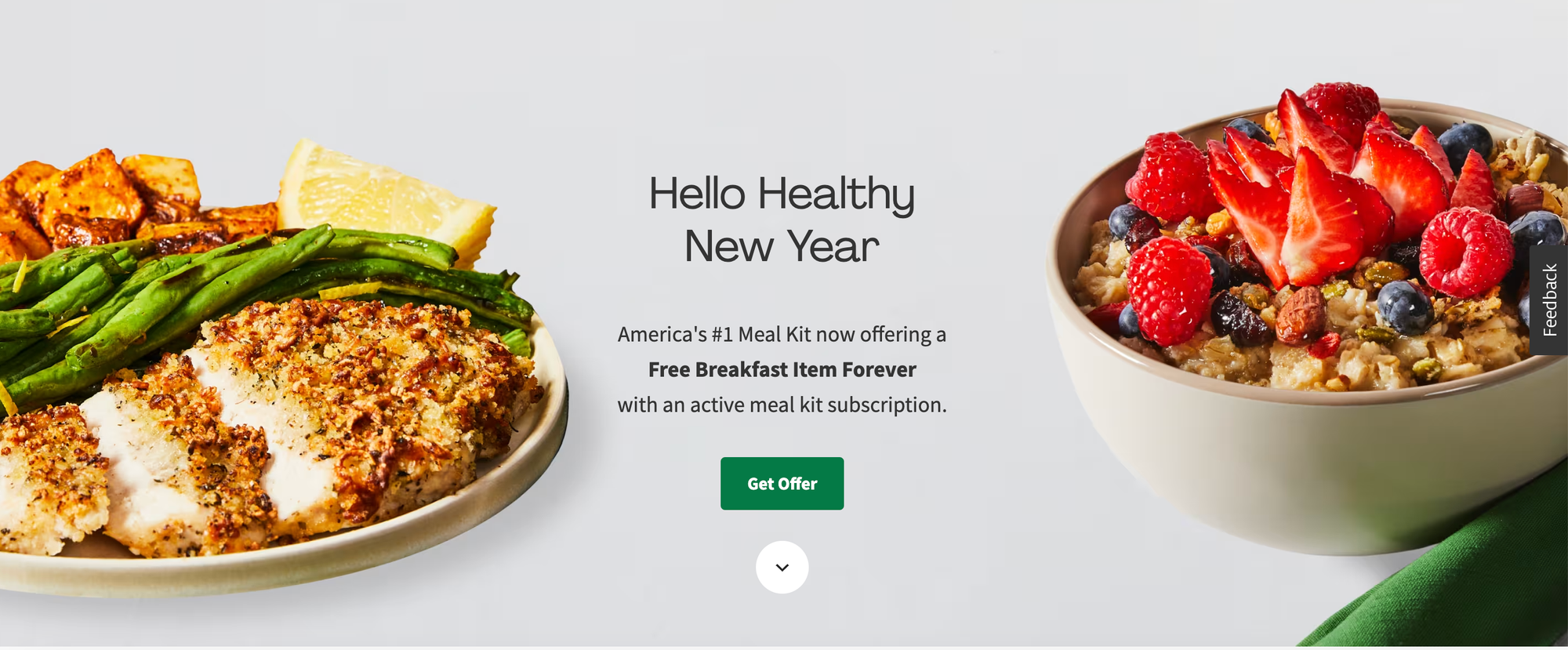
- Headline: Hello Healthy New Year: America's #1 Meal Kit now offering a Free Breakfast Item Forever
- Key details: Emphasizes convenience and customization, showcasing personalized menus and chef-curated recipes.
- Call to action: Get Started Today & Receive $70 Off Your First Box.
Meowbox
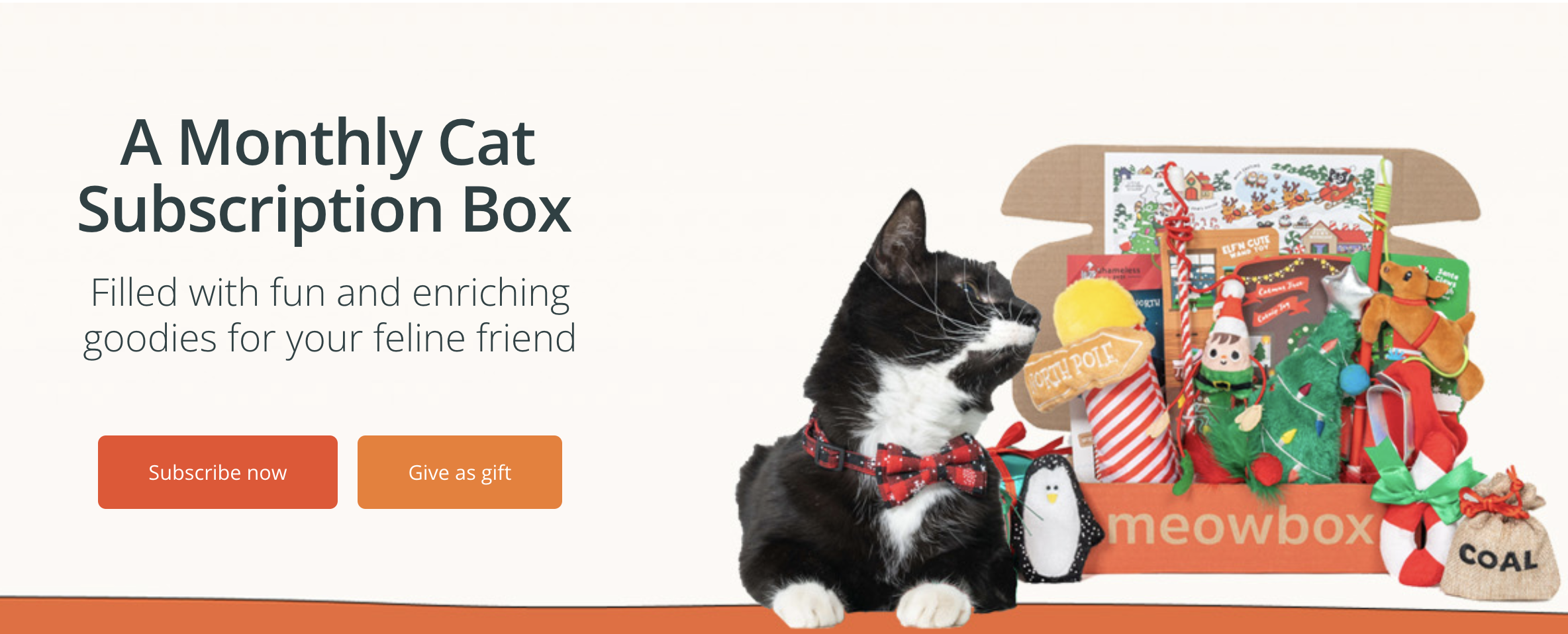
- Headline: A Monthly Cat Subscription Box
- Key details: Super attractive cat products for cat lovers.
- Call to action: Give us a gift
FabFitFun

- Headline: Holiday Deals Are Here!
- Key details: Blends curiosity and excitement, showcasing curated products from various categories.
- Call to action: Subscribe Today & Get Your First Box for $25!
Doodly
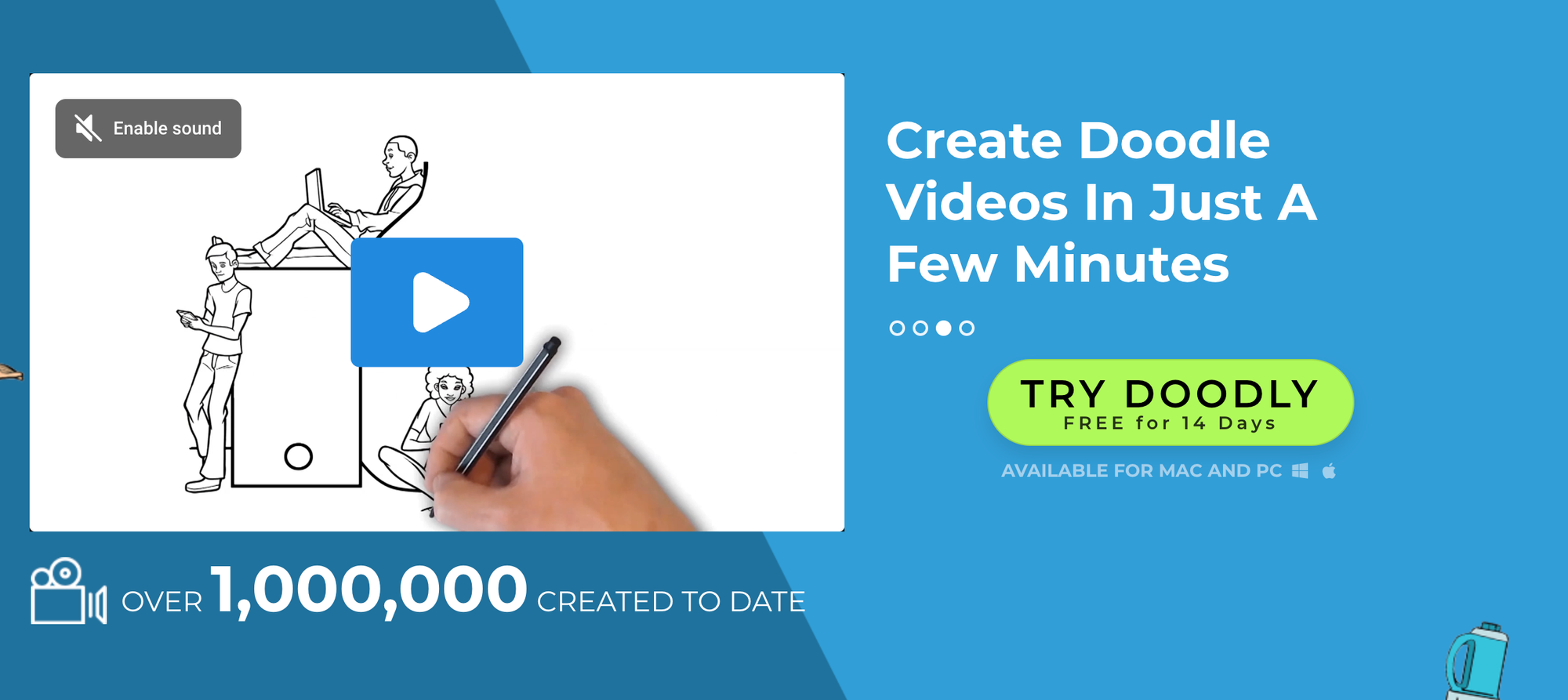
- Headline: Create Doodle Videos in Just a Few Minutes
- Key details: Focuses on solving problems, showcasing easy-to-use software with case studies and comparisons.
- Call to action: Start Your Free Trial & See Doodly in Action.
LivWatches

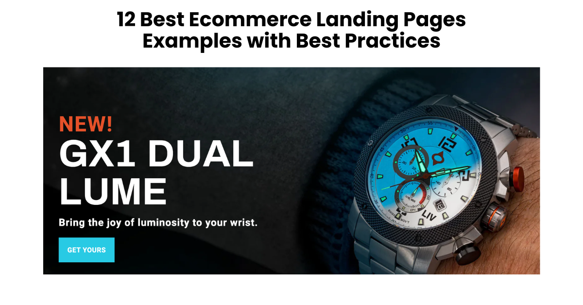
- Headline: Bring the joy of lumniosity to your wrist
- Key details: Positions brand as a watch expert, providing personalized recommendations and curated collections.
- Call to action: Get Your Watch Recommendation & Discover Your Timepiece Match.
Ascent Footwear

- Headline: Get into the Groove: Pain relief & enhanced support for sore feet
- Key details: Educates users about technical features and benefits, showcasing shoe construction and durability.
- Call to action: Find Your Perfect Pair & Get Free Shipping.
BoxyCharms
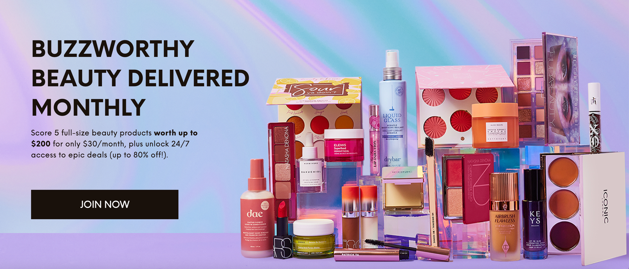
- Headline: Buzzworthy Beautify Delivered Monthly
- Key details: Creates urgency with countdown timers and limited-edition offers, emphasizing value and exclusivity.
- Call to action: Claim Your Box Now Before They're Gone!
Thistle
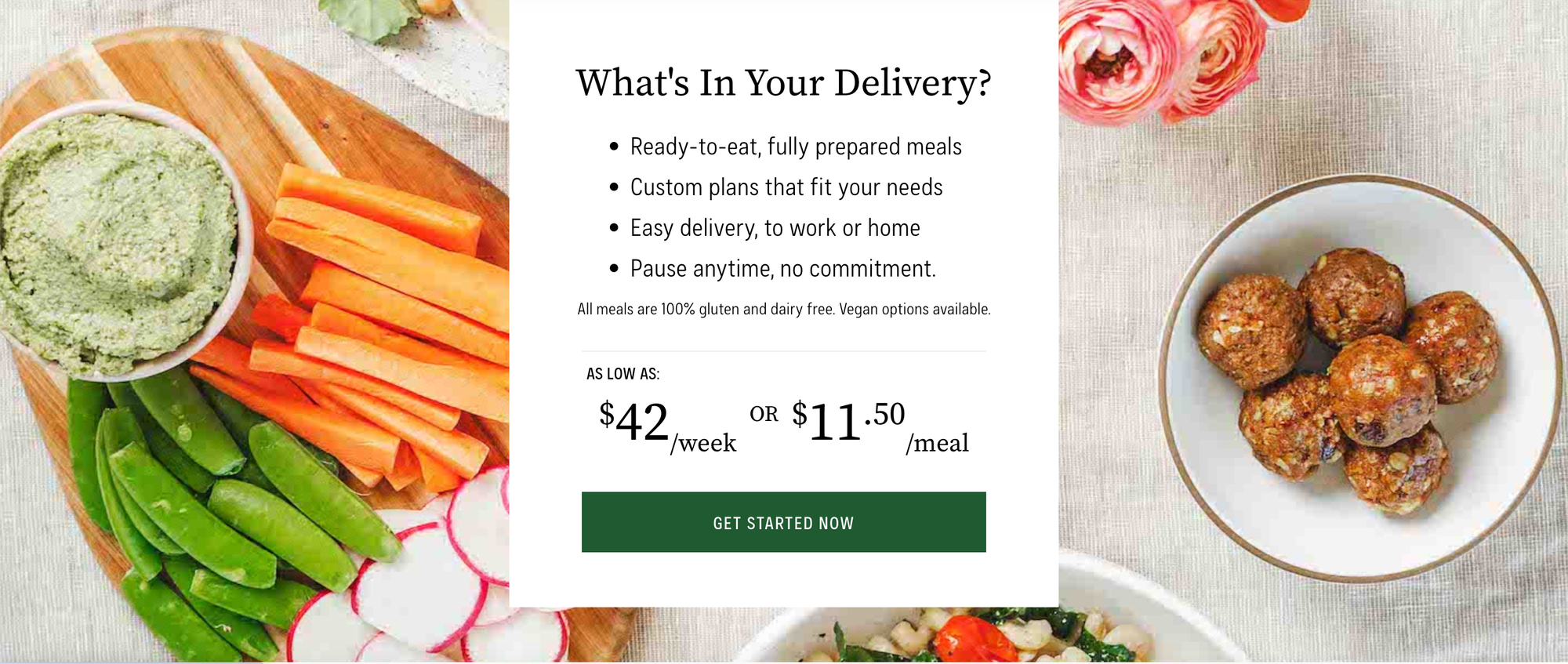
- Headline: What's In Your Delivery?
- Key details: Reduces risk with free trial and builds trust with customer testimonials, emphasizing convenience and health benefits.
- Call to action: Try Thistle Risk-Free & Start Eating Healthy Today.
WaterDrop
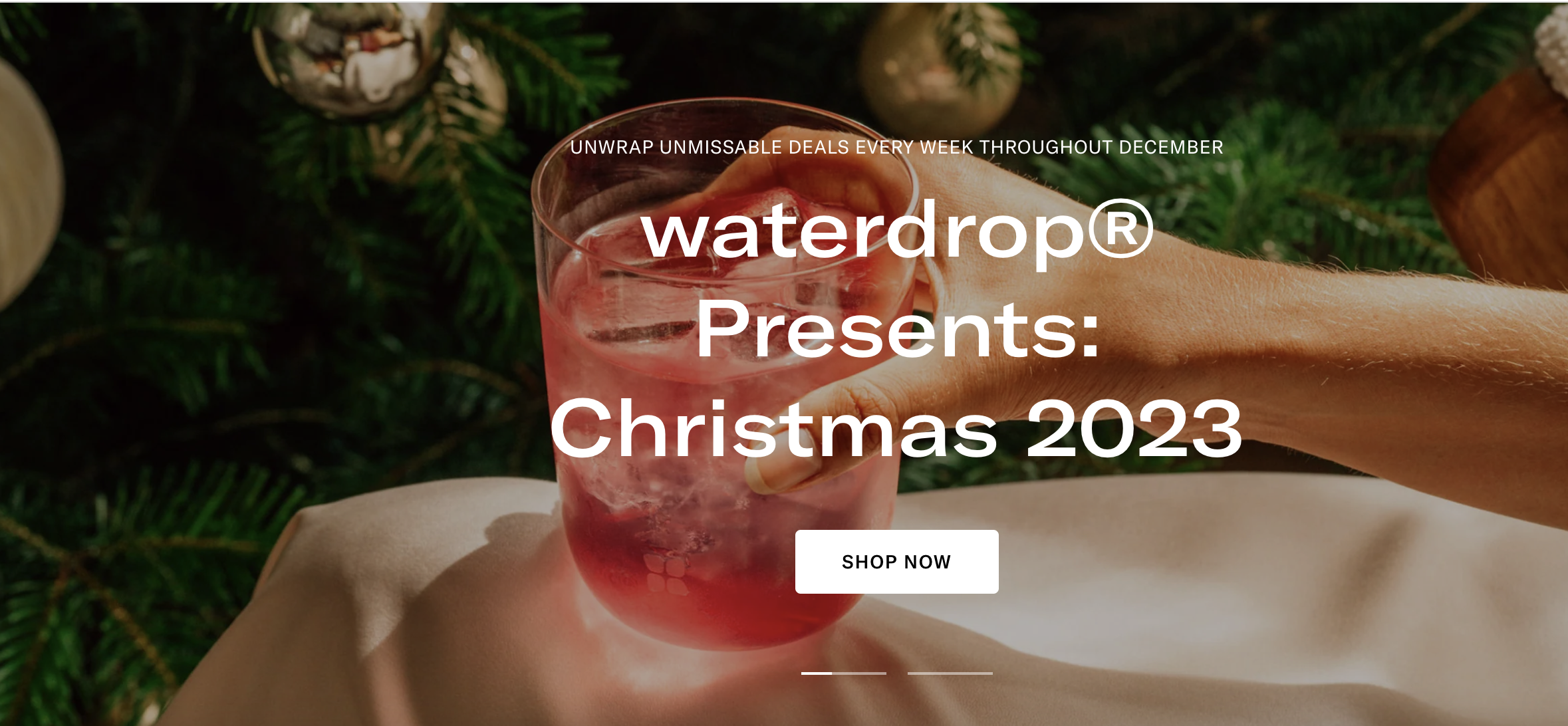
- Headline: Unwrap Unmissable Deals Every Week Throughout December
- Key details: Demonstrates product effectiveness with before-and-after visuals and customer reviews, showcasing taste and health benefits.
- Call to action: Get Your Starter Pack & Experience WaterDrop Magic.
Keeps
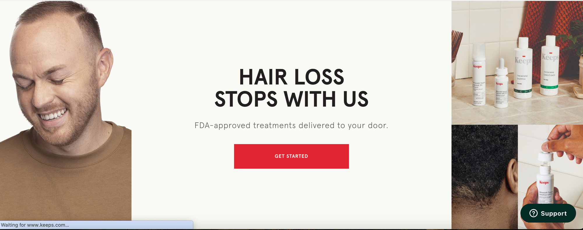
- Headline: Stop Hair Loss in Its Tracks: Personalized Solutions & Success Stories.
- Key details: Addresses concerns directly and showcases results with before-and-after photos and customer testimonials.
- Call to action: Take the Free Hair Quiz & Discover Your Personalized Hair Loss Plan.
Solo Stove
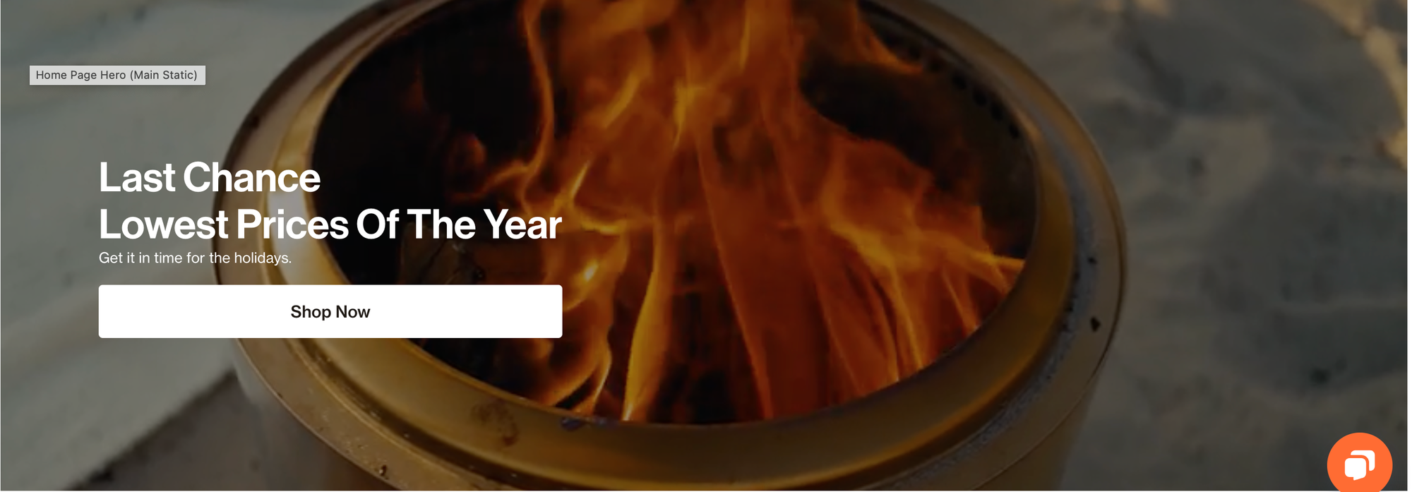
- Headline: Last Chance Lowest Prices of The Year
- Key details: Appeals to emotions and creates a sense of adventure with stunning visuals and customer experiences.
- Call to action: Shop Solo Stove & Bring the Fire to Your Backyard.
GoPro
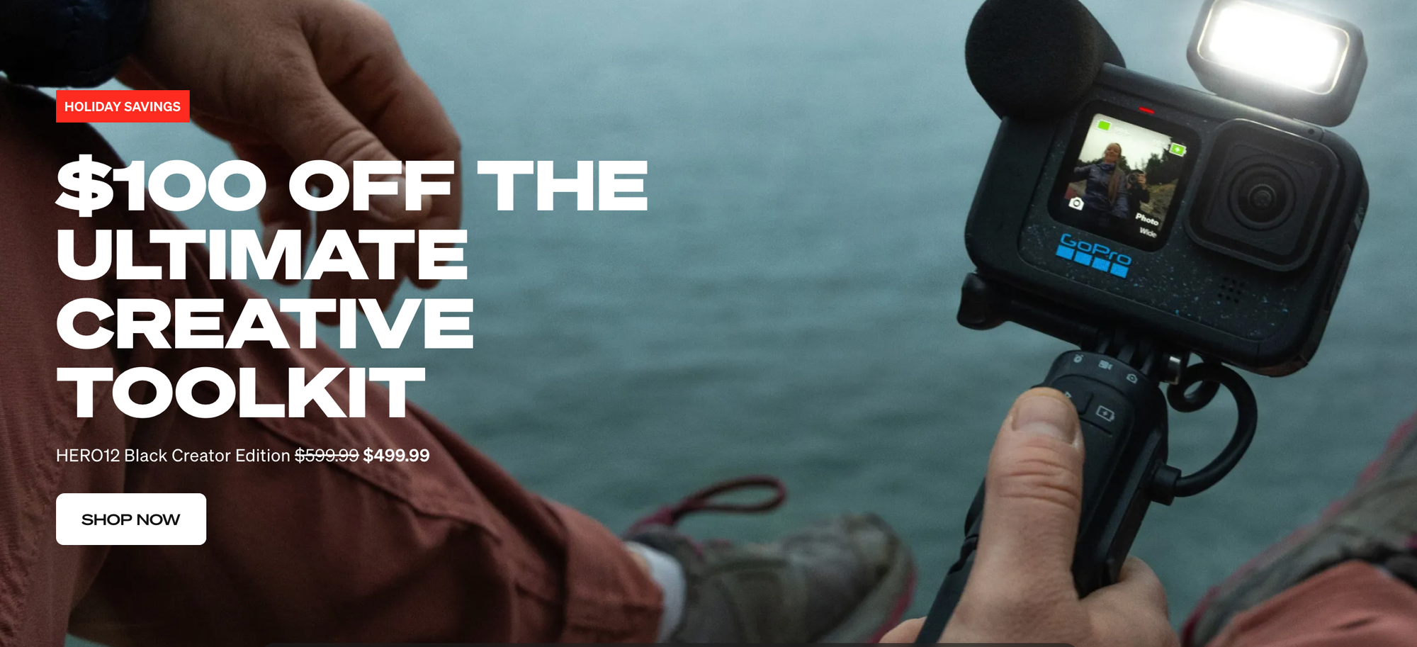
- Headline: $100 Off The Ultimate Creative Toolkit
- Key details: Highlights product capabilities with immersive video examples and user-generated content, showcasing versatility and durability.
- Call to action: Shop GoPros & Get Ready to Tell Your Story.
Charlie's Rawsome Granola
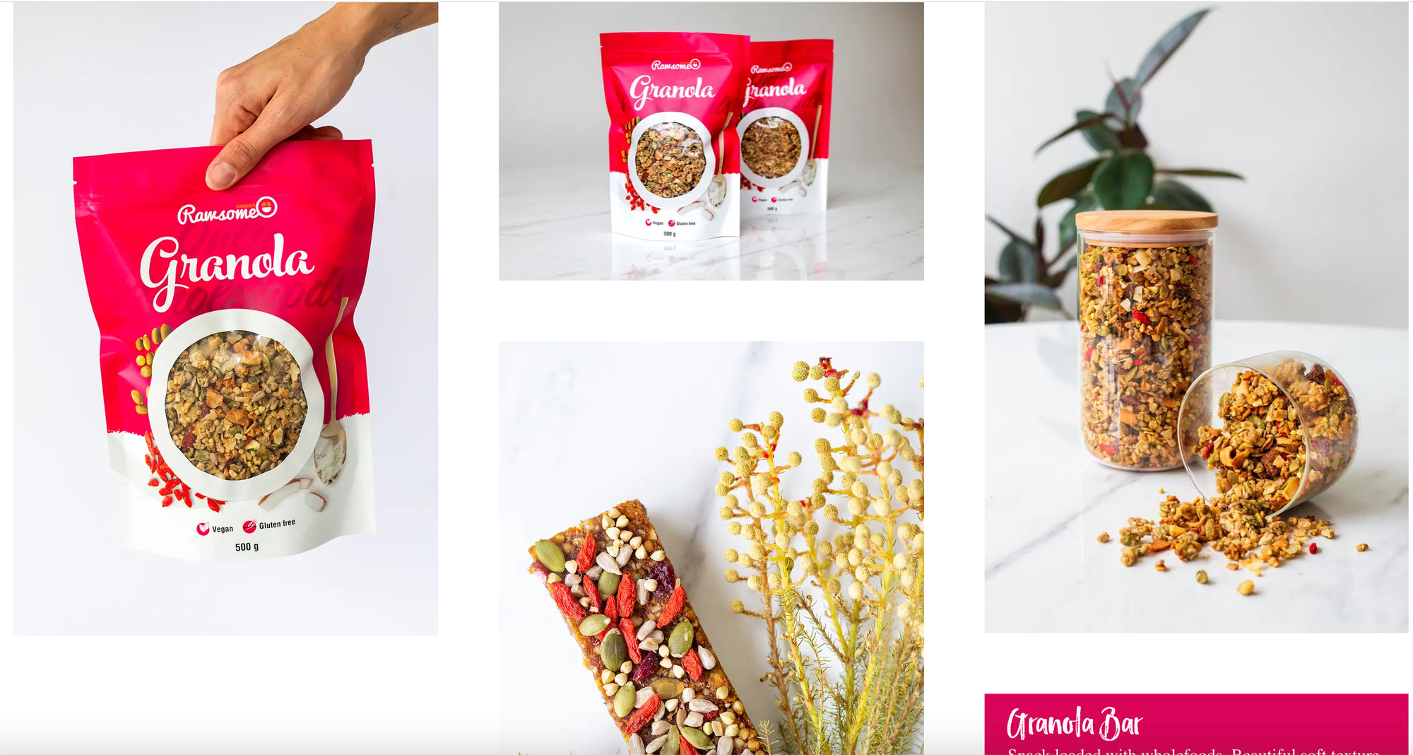
- Headline: Healthy Granola Delivered: Delicious, Nutritious, & Free Shipping on Subscriptions.
- Key details: Sweetens the deal with free shipping and bundle discounts, emphasizing convenience and healthy snacking.
- Call to action: Subscribe & Start Your Day with Rawsome Goodness.
Ecommerce Landing Page Best Practices
Creating effective ecommerce landing pages is crucial for driving conversions and enhancing the user experience. Here are some best practices to consider:
Clear and Compelling Headline
Craft a concise and attention-grabbing headline that clearly communicates the value proposition or key message.
Compelling Visuals
Use high-quality images or videos that showcase your products or convey the desired emotion to capture visitors' attention.
Concise and Persuasive Copy
Keep the text brief, focused, and persuasive. Highlight key benefits and features to encourage users to take the desired action.
Call-to-Action (CTA)
Place a prominent and compelling CTA button that stands out. Use action-oriented language to prompt users to make a purchase or take the next step.
Mobile Optimization
Ensure your landing page is optimized for mobile devices, as an increasing number of users shop on smartphones and tablets.
Fast Loading Speed
Optimize your landing page for fast loading times to prevent visitors from bouncing due to slow performance.
Social Proof
Include customer testimonials, reviews, or trust badges to build credibility and trust with potential buyers.
Limited Navigation
Minimize distractions by keeping navigation simple. Limit links and options to guide users towards the primary CTA.
Personalization
Use personalized content based on user behavior, preferences, or demographics to create a more tailored experience.
Highlight Special Offers
If applicable, showcase any discounts, promotions, or limited-time offers prominently on the landing page.
Trust and Security
Display trust symbols, security badges, or certifications to reassure visitors about the safety of their transactions.
A/B Testing
Continuously test different elements of your landing page, such as headlines, images, or CTAs, to identify what resonates best with your audience.
Responsive Design
Ensure your landing page adapts to various screen sizes and resolutions for a consistent experience across devices.
Clear Path to Checkout
Streamline the path to purchase by minimizing the steps required for users to complete a transaction.
Analytics and Tracking
Implement analytics tools to track user behavior on the landing page, enabling data-driven optimizations.
Conclusion
Understanding the technique of landing pages is the key to allowing conversion magic in the ever-changing landscape of e-commerce. This article examined 12 great examples packed with best practices, ranging from compelling headlines and visual feasts to frictionless funnels and data-driven decisions. It's now your turn. Take these insights and customize them to your company story to create landing pages that not only capture clicks but also convert them into loyal customers. Remember that the journey to purchase should be more than just a transaction.
FAQs
What is the difference between a product page and a landing page ecommerce?
A product page in ecommerce is specifically designed to showcase details of a single product, including descriptions, images, and prices, aiming to facilitate the decision to purchase. In contrast, a landing page is a standalone page created for marketing or advertising campaigns, aiming to prompt a specific action from visitors, such as sign-ups or sales, often focusing on a particular promotion or product range.

.png)
