
.png)
Shopify Design System: Benefits, Guidelines & Uses
Imagine a world where every Shopify store looked and felt the same, but was still unique and branded to the individual business. A world where customers could easily navigate from one store to another without having to learn a new interface each time. A world where merchants could build and launch their stores quickly and easily, without having to worry about the design and development aspects.
This world is possible with the Shopify design system.
The Shopify design system is a set of reusable components and guidelines that merchants can use to build beautiful and functional Shopify stores. It's designed to be flexible and adaptable, so merchants can create stores that are unique to their brand and business.
In this blog post, we'll explore the benefits of using the Shopify design system, as well as some tips for using it effectively.
What is Shopify Design System?
The Shopify design system is a collection of reusable components, patterns, and guidelines that merchants can use to build beautiful and functional Shopify stores. It's designed to be flexible and adaptable, so merchants can create stores that are unique to their brand and business.
The Shopify System design includes a wide range of components, such as buttons, menus, forms, images, and typography. It also includes a set of guidelines that cover everything from color and spacing to typography and accessibility.
Merchants can use the Shopify design system to build their stores from scratch or to customize existing themes. It's a great way to ensure that your store has a consistent look and feel, and that it's easy for customers to navigate.
What is Shopify Polaris Design System?
Shopify Polaris is a comprehensive design system created by Shopify, a leading e-commerce platform. It serves as a unified framework for designing user interfaces across all Shopify applications and products. Polaris shopify includes a set of design principles, guidelines, and pre-built shopify UI components that ensure a consistent and user-friendly experience for merchants. The system places a strong emphasis on accessibility, providing resources to create interfaces that are usable by individuals with disabilities. With content guidelines, design files, and developer resources, Polaris supports designers and developers in building high-quality, accessible, and visually appealing experiences for Shopify users. It is continuously updated to stay aligned with evolving design trends and user needs, making it an essential tool for creating effective and user-centric interfaces within the Shopify ecosystem.
Shopify Polaris Examples
Here are some examples of how the Shopify Polaris design system is applied in real-world interfaces:
Dashboard Interface
In the Shopify admin dashboard, you'll see the use of consistent typography, color schemes, and layout structures as defined by Polaris. Buttons, navigation elements, and charts all adhere to the design system's guidelines, providing a cohesive and user-friendly experience for merchants managing their stores.
Product Listings
When viewing product listings in a Shopify store, you'll notice the use of standardized product cards. These cards display product images, titles, prices, and other relevant information in a consistent format, allowing for easy browsing and comparison.
Checkout Process
The checkout process in Shopify follows Polaris guidelines for form design, with clear labels, input fields, and buttons. The step-by-step progression and overall layout of the checkout pages are designed to provide a seamless and intuitive experience for customers.
Button Design
Buttons throughout the Shopify interface adhere to Polaris guidelines, with consistent styling for primary, secondary, and tertiary actions. This ensures that users can easily recognize and interact with buttons based on their intended actions.
Modal Windows
When performing actions that require confirmation or additional information, Shopify uses modal windows that follow Polaris design patterns. These modals have a consistent appearance, providing a clear and focused interaction for users.
How to use Shopify Design System
Using the Shopify design system, known as Polaris, involves following a set of guidelines, principles, and components provided by Shopify to create a cohesive and user-friendly interface for your online store. Here's a step-by-step guide on how to effectively utilize the Polaris Shopify design system:
1. Familiarize Yourself with Polaris
Begin by thoroughly reading the Polaris documentation provided by Shopify. This will give you a solid understanding of the design principles, guidelines, and components available to you.
2. Explore Polaris Components
Take time to explore the pre-built UI components provided by Polaris. These include buttons, navigation elements, form fields, modals, and more. Familiarize yourself with how these components are designed and how they can be used in your store.
3. Maintain Consistency
Ensure that you use Polaris components consistently throughout your store. This helps create a unified and recognizable user experience for your customers.
4. Apply Typography Guidelines
Use the typography guidelines provided by Polaris for headings, body text, and other textual elements. This ensures that your content is presented in a clear and readable manner.
5. Leverage Color Guidelines
Follow Polaris color guidelines for elements like backgrounds, text, and accents. This helps maintain a visually appealing and harmonious color scheme in your store.
6. Implement Accessibility Features
Pay close attention to Polaris' accessibility guidelines. Ensure that your store is designed to be usable by individuals with disabilities. This includes considerations for color contrast, keyboard navigation, and screen reader compatibility.
7. Utilize Polaris Content Guidelines
Apply Polaris content guidelines to write clear and effective copy for your store. This includes guidelines on tone, style, and messaging to ensure consistency in your brand communication.
8. Customize Within Polaris Framework
While Polaris provides a set of standard components and guidelines, you can still customize within this framework to align with your brand's unique identity. However, ensure that your customizations still adhere to Polaris principles.
9. Responsive Design
Design your store to be responsive, ensuring that it functions well on various devices and screen sizes. This aligns with Polaris' emphasis on providing a seamless experience across different platforms.
10. Regularly Review and Update
Keep up to date with any changes or updates to the Shopify design system. Regularly reviewing the documentation ensures that you're using the latest components and following best practices.
11. Seek Inspiration from Examples
Look at examples of other Shopify stores that effectively utilize the Shopify design system. This can provide inspiration and insights into how to implement Polaris effectively.
By following these steps and leveraging the resources provided by Shopify's Polaris design system, you'll be able to create a user-friendly, visually appealing, and accessible online store that aligns with best practices in e-commerce design.
Benefits of Shopify Design System
The Shopify design system, known as Polaris, offers a range of benefits for both designers and developers working on the Shopify platform. Here are some of the key advantages:
Consistency: Polaris provides a standardized set of design principles, components, and guidelines. This ensures a consistent and cohesive visual and interactive experience across all Shopify applications and products.
Efficiency: Designers and developers can leverage pre-built UI components from Polaris, saving time and effort in creating and styling elements from scratch. This leads to faster development and deployment of Shopify stores and applications.
Accessibility: Polaris places a strong emphasis on accessibility, providing guidelines and resources to create interfaces that are usable by individuals with disabilities. This helps in making Shopify stores inclusive and compliant with accessibility standards.
User-Friendly Experience: The design system is geared towards creating a user-friendly experience for both merchants managing their stores and customers navigating the storefront. Clear layouts, intuitive navigation, and well-designed components contribute to a positive user experience.
Streamlined Collaboration: Polaris serves as a common language for designers, developers, and other stakeholders working on Shopify projects. This fosters effective communication and collaboration, as everyone follows the same design principles and guidelines.
Flexibility and Customization: While Polaris provides a set of standard components and guidelines, it also allows for customization within this framework. This means you can adapt the design to align with your brand's unique identity and requirements.
Scalability: Polaris is designed to accommodate the growth and complexity of Shopify stores and applications. It provides a solid foundation for building interfaces that can handle increased traffic and evolving business needs.
Reduces Design Debt: Design debt refers to the accumulation of inconsistencies and design-related issues over time. By adhering to Polaris, you minimize the risk of design debt, ensuring a more maintainable and adaptable codebase.
Easier Onboarding and Training: For new team members or collaborators, Polaris serves as a valuable resource. It provides clear guidelines and resources that facilitate onboarding and training, allowing them to quickly become productive contributors.
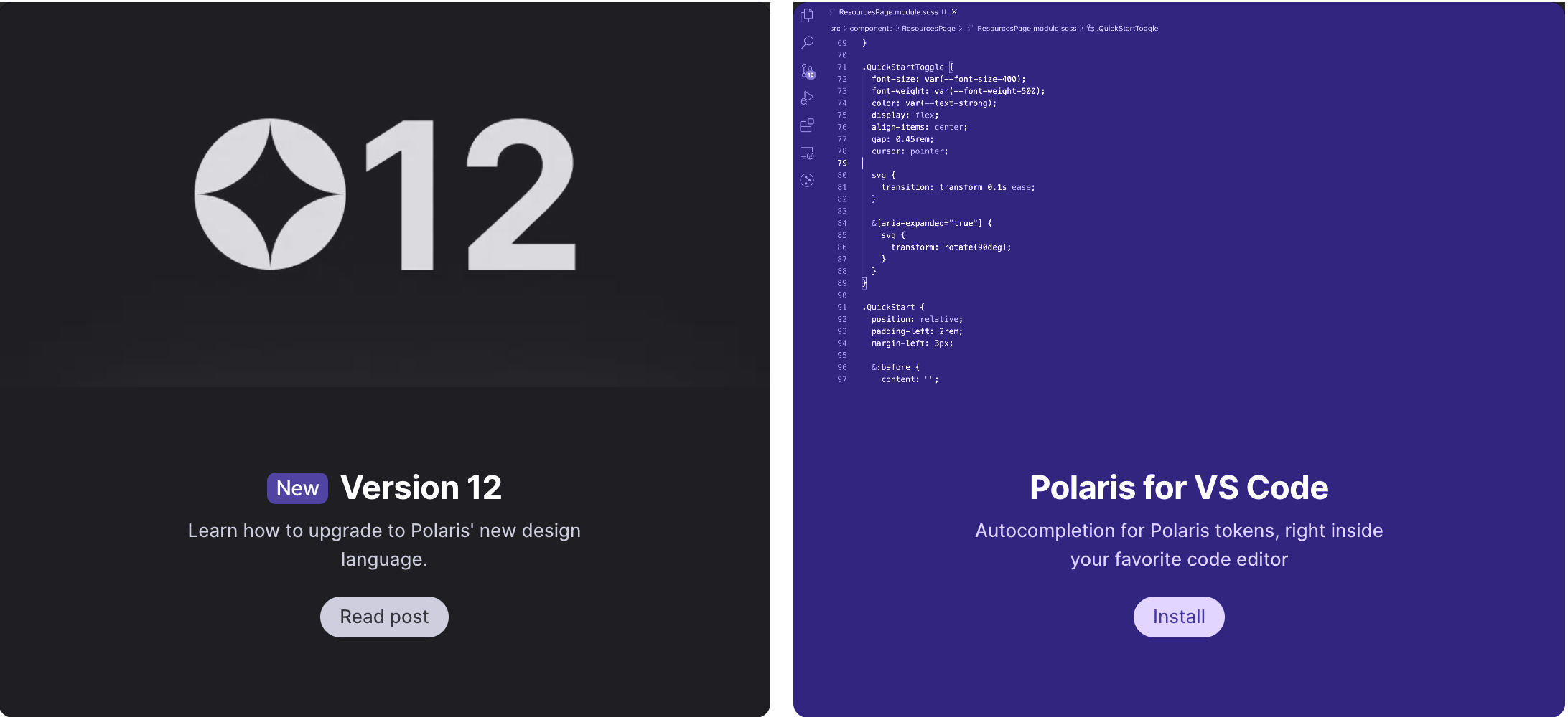
Continuous Updates and Improvements: Shopify actively maintains and updates the Shopify design system to reflect evolving design trends, technology advancements, and user needs. This means that designers and developers can leverage the latest best practices and components in their projects.
Enhances User Trust: A well-designed and consistent user interface instills trust in users. When they encounter a familiar and user-friendly interface, they are more likely to engage with the platform and complete their desired actions.
Shopify Brand Guidelines
To use the Shopify design system, known as Polaris, effectively, it's important to follow a set of guidelines and best practices. Here are some key recommendations for using Polaris efficiently and producing high-quality user interfaces:
Familiarize Yourself with Polaris Documentation
Start by thoroughly reading and understanding the Polaris documentation provided by Shopify. This will give you a strong foundation in the design principles, guidelines, and components available.
Maintain Consistency
Use Polaris components consistently throughout your project. This ensures a unified and recognizable user experience for your users.
Leverage Pre-Built Components
Utilize the pre-built UI components provided by Polaris. These components are designed to be versatile and can save you time in development.
Consider Accessibility
Follow Polaris' accessibility guidelines to ensure that your interface is usable by individuals with disabilities. Pay attention to color contrast, keyboard navigation, and other accessibility features.
Customize Within Polaris Framework
While Polaris provides a standardized set of components, you can still customize within this framework to align with your brand's unique identity. However, ensure that your customizations still adhere to Polaris principles.
Responsive Design
Design your interface to be responsive, ensuring that it functions well on various devices and screen sizes. This aligns with Polaris' emphasis on providing a seamless experience across different platforms.
Use Polaris Content Guidelines
Apply Polaris content guidelines to write clear and effective copy for your project. This includes guidelines on tone, style, and messaging to ensure consistency in your brand communication.
Stay Updated with Polaris Changes
Regularly review the Polaris documentation to keep up with any changes or updates. This ensures that you're using the latest components and following best practices.
Test with Real Users
Conduct usability testing with real users to gather feedback on how they interact with your interface. This can provide valuable insights and help identify areas for improvement.
Engage with the Polaris Community
Join the Polaris community of designers, developers, and Shopify merchants. Engaging with the community can provide additional insights, best practices, and resources for using Polaris effectively.
Seek Inspiration from Examples
Look at examples of other projects that effectively utilize the Shopify design system. This can provide inspiration and insights into how to implement Polaris effectively.
Provide Feedback to Shopify
If you encounter any challenges or have suggestions for improvements in Polaris, consider providing feedback to Shopify. This helps contribute to the ongoing refinement of the Shopify design system.
By following these Shopify brand guidelines, you'll be able to use the Shopify Polaris design system effectively, resulting in a user-friendly, visually appealing, and accessible user interface for your project.
How to grow your beautified Shopify store with Manifest AI?
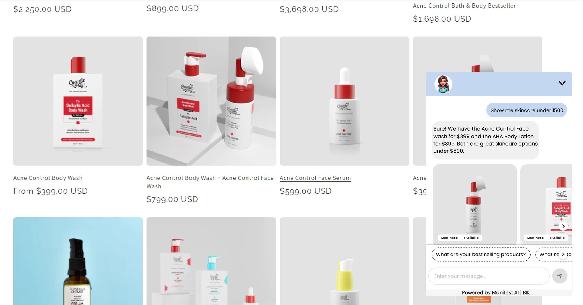
Here are some ways to grow your beautified Shopify store with Manifest AI:
- Use Manifest AI to create personalized product recommendations. Manifest AI can analyze customer data, such as purchase history, browsing behavior, and customer reviews, to identify customer preferences and recommend relevant products. This can help you to increase sales and conversion rates.
- Use Manifest AI to automate your customer service. Manifest AI can answer customer questions, provide support, and resolve issues. This can help you to improve customer satisfaction and reduce the workload on your customer support team.
Final thoughts
The Shopify design system is a powerful tool that can help you build beautiful, functional, and accessible Shopify stores and apps. It provides a set of reusable components, patterns, and guidelines that can save you time and effort, and help you create a consistent and user-friendly experience for your customers.
The Shopify design system helps to ensure that all Shopify stores and apps have a consistent look and feel. This makes it easier for customers to navigate and use Shopify products. If you're thinking about building a Shopify store or app, or if you're looking for ways to improve your existing store or app, I encourage you to check out the Shopify design system. It's a great resource for merchants and developers of all levels of experience.
Frequently asked questions
Here are the most frequently asked questions related to Shopify system design:
What is the name of the Design System in Shopify?
The design system used by Shopify is called "Polaris."
What is Polaris Shopify?
Polaris is Shopify's comprehensive set of design guidelines, components, and resources that provide a consistent and cohesive framework for designing and building user interfaces within the Shopify platform. It serves as a unified foundation for creating visually appealing, user-friendly, and accessible interfaces across all Shopify applications and products.
Is Polaris design system open source?
Yes, Shopify's Polaris design system is open source. This means that the code, documentation, and resources that make up Polaris are publicly accessible and can be viewed, modified, and used by developers and designers. The open-source nature of Polaris allows for collaboration and contributions from the community, enabling users to adapt and customize the design system to better suit their specific needs. This openness promotes transparency and encourages innovation within the Shopify ecosystem.